Lettered Lives: Crafting Voice from the Streets
- Sep 10, 2025
- 2 min read
Updated: Sep 11, 2025

For the second post on Thoughtfully Crafted, I wanted to turn my attention to a form of design that exists right in the open- loud, lived, and full of personality. Yet rarely recognised in formal design circles. The hand-painted shop signs found across South Asia and parts of Africa are more than just advertisements. They are expressions of identity, culture, economy, and language. Bold colour palettes, uneven baselines, flourishes, and the visible hand of the painter. They aren’t trying to be perfect, they’re trying to be seen.
Growing up in New Delhi, I remember walking through markets where hand-painted boards stacked one over the other were shouting out services, repairs, shops, and traditional Mithai. In these signs, you could hear the voice of a place- informal, charming, direct. And though they're slowly disappearing under vinyl and print, they hold a kind of authenticity that can’t be replicated.
This project explores vernacular typography and what it means for design to speak from the ground up. It’s about honouring visual languages shaped by labour, locality, lived experience, and not just corporate grids. These signs might be fading, but they carry decades of visual culture, entrepreneurship, and community identity. They tell stories of migration, resilience, local trade, and artistic labour- often painted by anonymous sign writers whose work shaped neighbourhoods. In celebrating this form, this project asks:
What gets preserved, and what gets replaced? Whose design stories do we remember, and which do we forget?
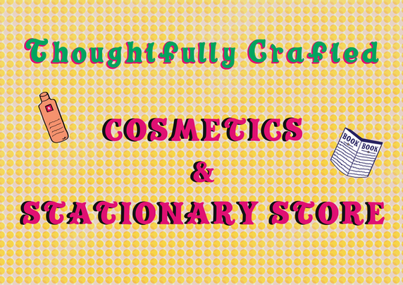
As a graphic designer, I'm especially interested in how type carries character. For this post, I created a custom display typeface inspired by the expressive lettering found in these street signs, combining letterforms from both South Asian and African influences.
The typeface doesn’t aim to clean up or refine what already exists instead, it leans into the quirks: exaggerated strokes, misaligned characters, playful widths. It’s a tribute to handmade imperfection and cultural voice. Alongside the typeface, I’ve designed a series of posters that use it to explore the idea of public language and how type and tone shape the way we read not just messages, but places. This was one of my first ever typeface explorations, and I had so much fun bringing it to life, experimenting with forms, quirks, and the bold character that makes vernacular lettering so expressive. It’s imperfect in all the best ways, and that’s exactly the point.
This is my way of remembering. A thoughtfully crafted response to everyday artistry, rooted in place.
I’d love to know- are there signs, symbols, or vernacular visuals in your neighbourhood that stick with you?
Let’s talk about where design lives, and whose voices it carries.
You can download the font here and use it to bring a bit of that energy, charm, and everyday storytelling into your own creative work (with a nod to where it came from).
#VernacularTypography #HandPaintedSigns #TypefaceDesign #SouthAsianDesign #TypographicHeritage #DesignWithCharacter #ThoughtfullyCrafted #CommunityDesign #GraphicStorytelling #CreativeTypography #LocalVoices #DesignInContext


Comments